Use GitMCloud on a phone
GitMCloud is responsive — the same site adapts to a phone screen. There is nothing to install and no separate mobile app: open the same link in your phone's browser and the layout switches to a touch-friendly form below roughly tablet width. Everything you can do on the desktop is still here; only the layout changes.
The desktop layout is unchanged. The mobile experience is an additive layer that appears only on small screens — wider browsers look and behave exactly as before.
Getting around: the bottom bar
On a phone the desktop tab strip is replaced by a bottom navigation bar in the thumb zone:
- Files, BOM, Snapshots, Messages, and More.
- Messages is promoted to the bar on mobile (phones are messaging devices).
- More opens a sheet with Branch, Team, and Settings.
The top bar is compact: the brand and your avatar stay visible, the repository and branch drop to a second line, and a ⋮ overflow button absorbs Refresh, Settings, and Help.
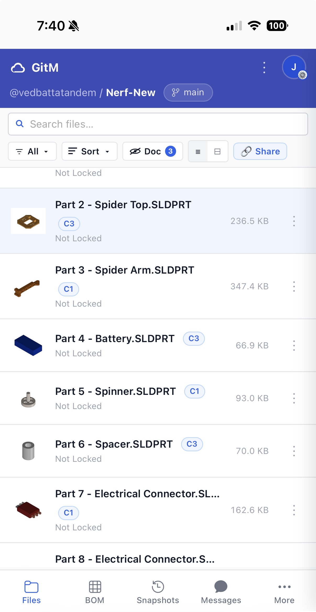
Files: cards and the action sheet
File rows become roomy, tappable cards showing the thumbnail, name, badges, and lock status. The toolbar collapses so search gets its own full-width row, with filter and sort folded beside it.
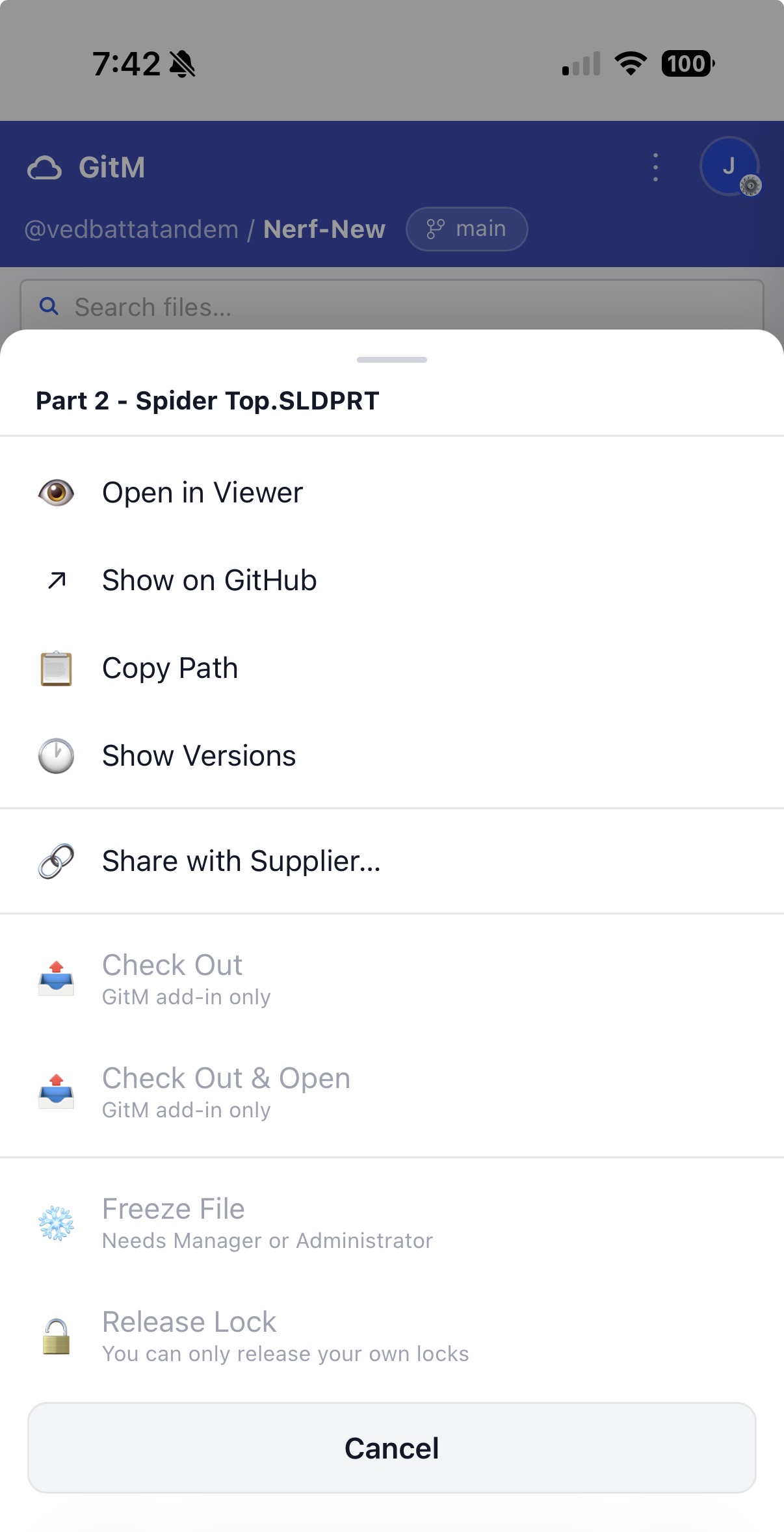
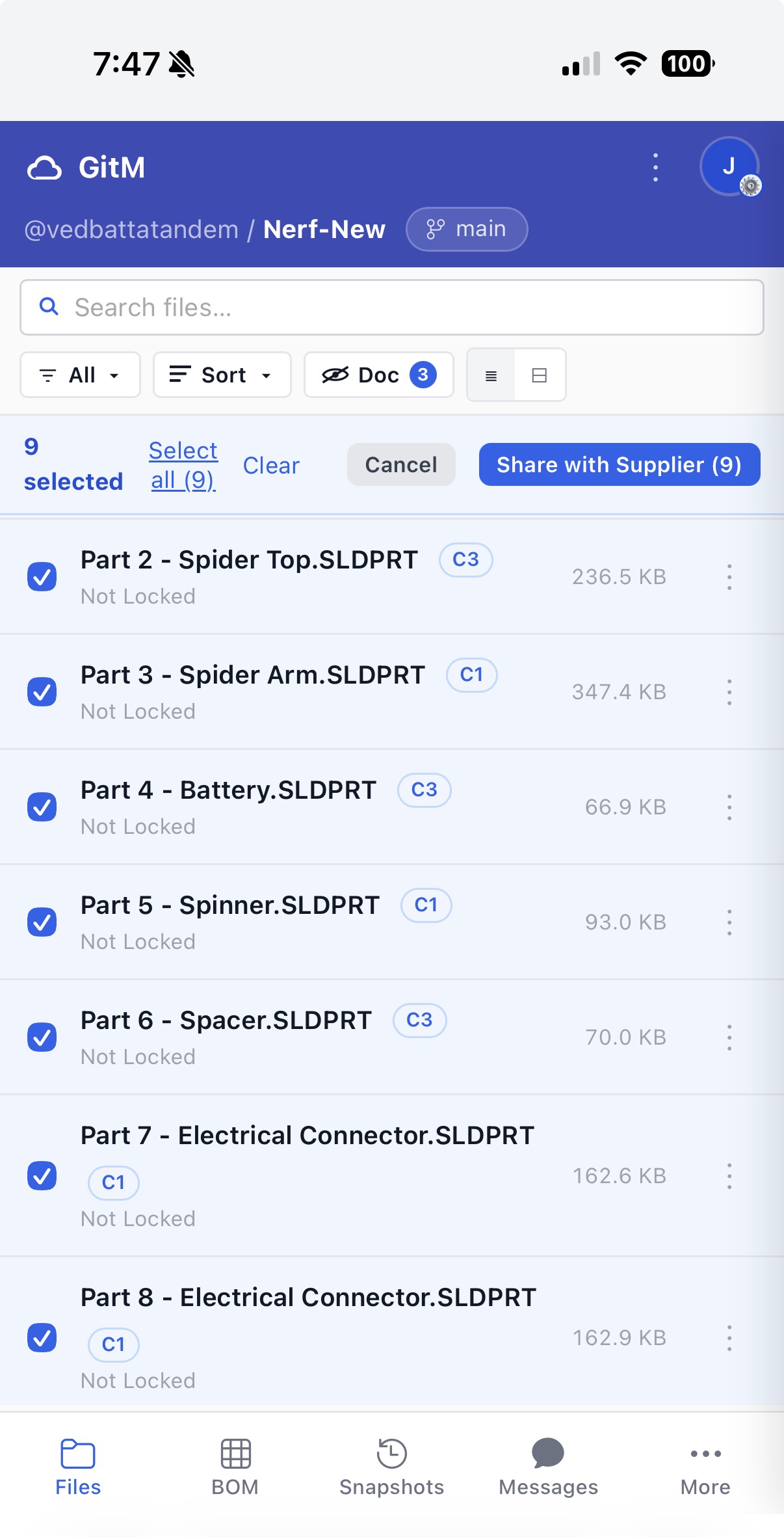
Because phones have no right-click, each card has a ⋮ button. Tapping it opens an action sheet from the bottom with the same actions as the desktop right-click menu — Open in Viewer, Share, Freeze, Allocate Part Number, and so on. Actions you can't use show their reason inline (for example, "GitM add-in only" or "Needs Manager or Administrator") since there are no hover tooltips on touch.
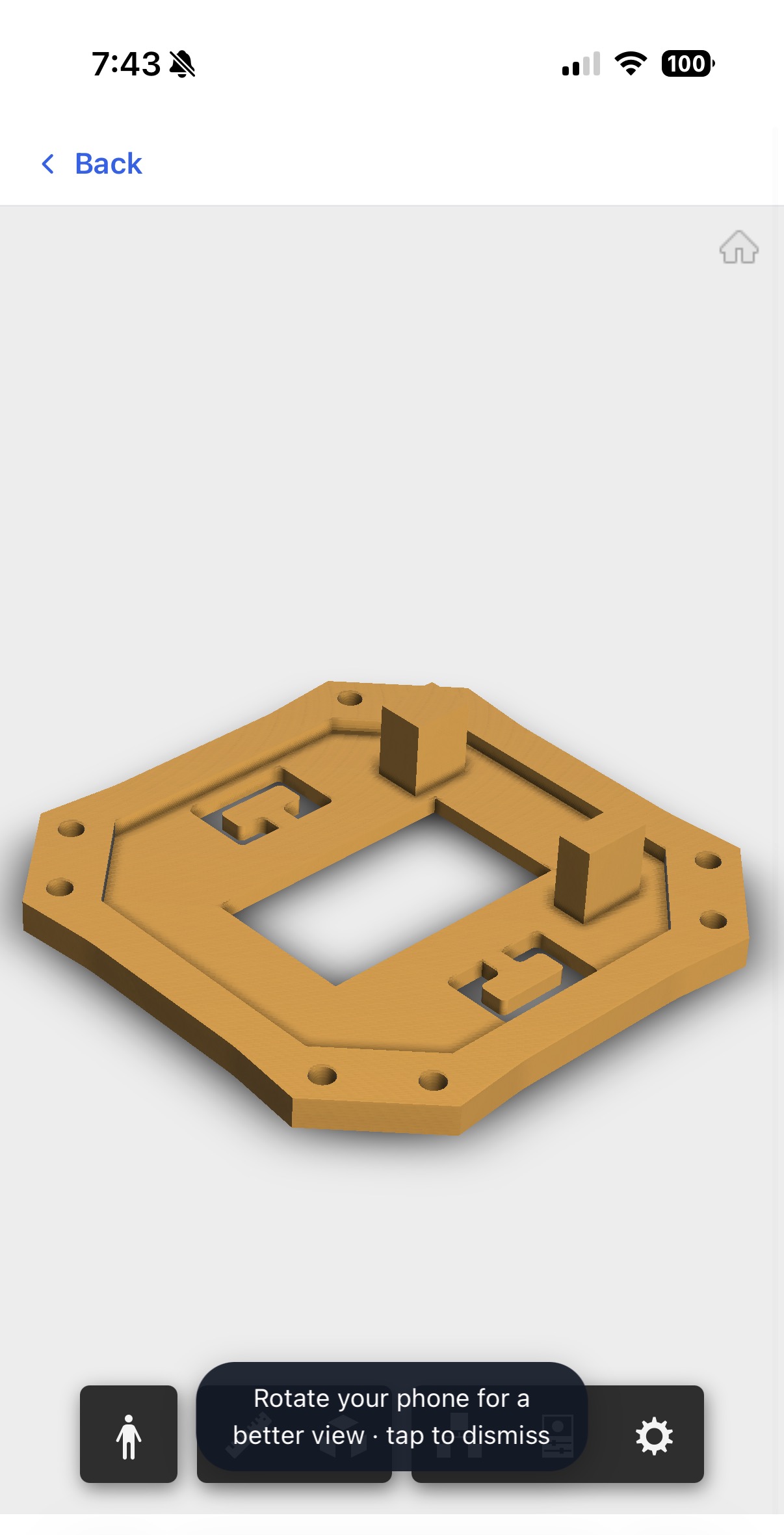
Viewing a file: fullscreen
Opening a CAD file, drawing, PDF, or image takes over the whole screen so you get the most room to see it. A Back bar sits at the top to return to the list, and the first time you open a viewer a one-time hint suggests rotating your phone for a wider view. Pinch-to-zoom works inside the viewer as usual.
Reading a BOM
A bill of materials keeps its real table on mobile rather than collapsing, so you can still compare columns. The Part Number column is frozen to the left edge and the Qty column is frozen to the right; the descriptive columns in between scroll sideways. The line-number column is dropped to save space. Tap a row to expand its detail as on desktop.
Panels and chat
Settings, your profile, the share dialog, and the messaging panel open as fullscreen sheets on a phone instead of floating windows. In Settings, the row of tabs scrolls sideways so all of them stay reachable. Messaging becomes a fullscreen chat.
Supplier Exchange on a phone
The public Supplier Exchange link is designed mobile-first — a supplier will usually open a share link on a phone. The page stacks into a single column with large, full-width Download buttons, and needs no account or sign-in.
What's different from desktop
| Area | On a phone |
|---|---|
| Navigation | Bottom bar (Files · BOM · Snapshots · Messages · More) instead of the top tab strip |
| Header actions | Refresh / Settings / Help move into the ⋮ overflow menu |
| File actions | ⋮ action sheet instead of right-click; disabled reasons shown inline |
| File viewer | Fullscreen takeover with a Back bar and a rotate hint |
| BOM | Frozen Part No + Qty columns with the middle scrolling sideways |
| Dialogs | Settings / profile / share / messaging open fullscreen |
No capabilities are removed on mobile — the same role-based actions apply. Actions that need the GitM add-in (check in/out, generate a BOM, stamp a part number, create or merge branches) are unavailable here exactly as they are on the desktop browser.